FEATURED WORK
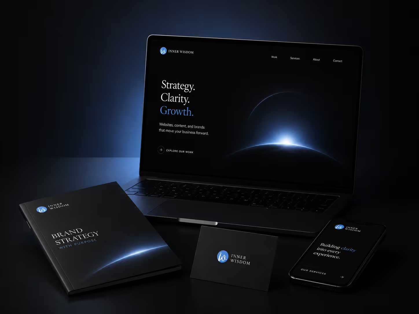
A premium digital presence designed to bring strategy, clarity, and growth into one refined experience.
.svg)
Building a financial identity designed to signal clarity, confidence, and trust.

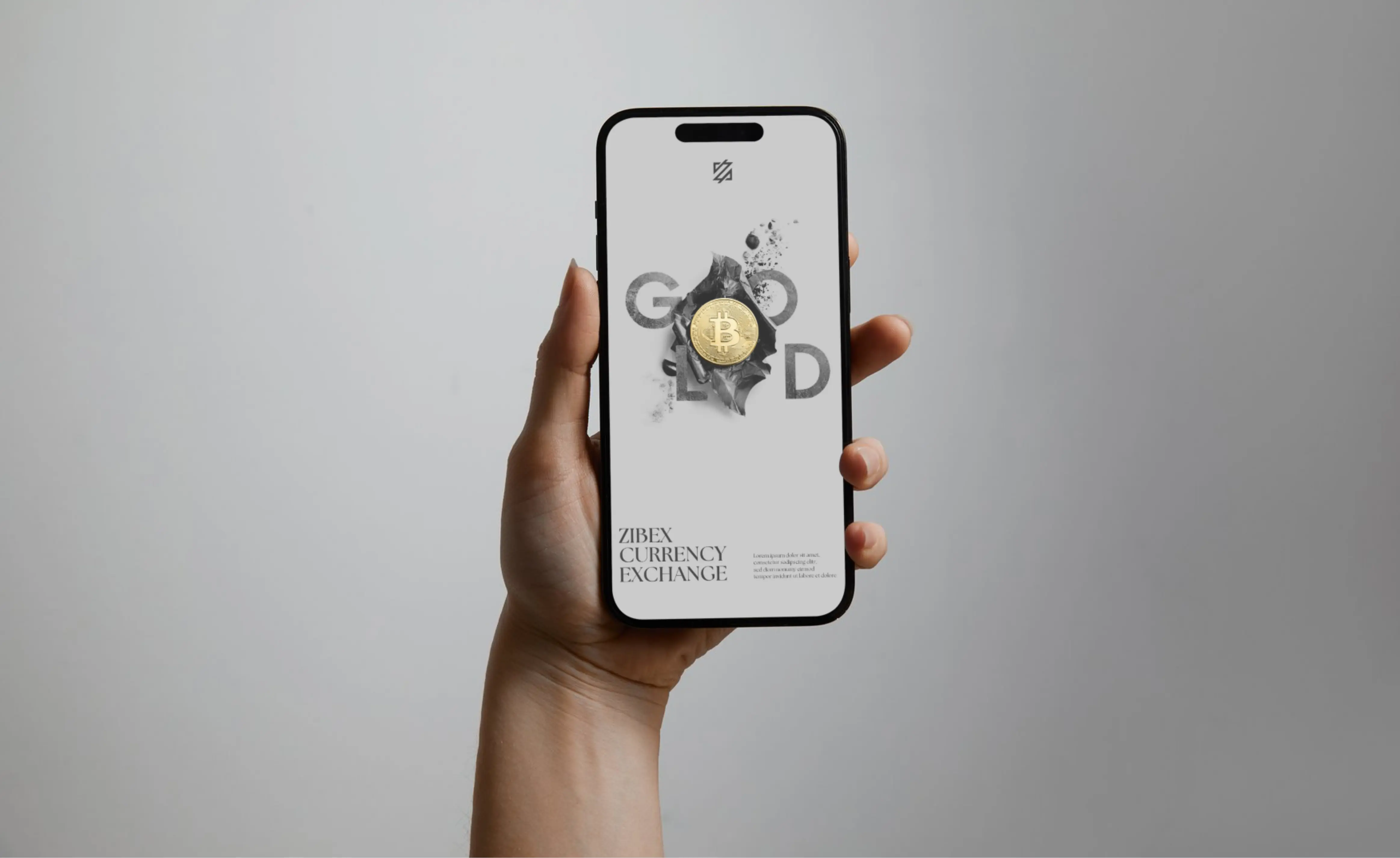
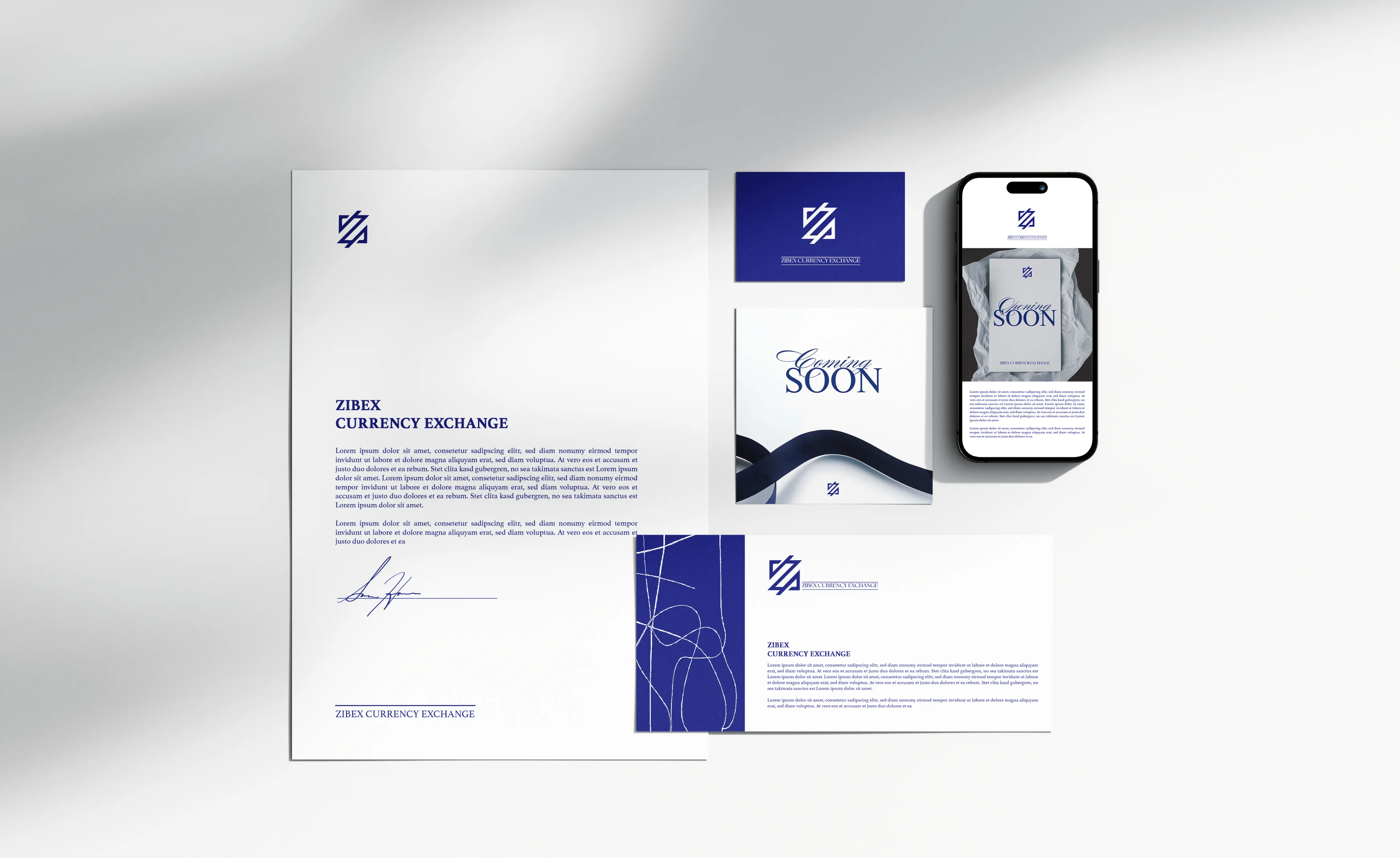
The identity was designed for a category where credibility matters immediately. Rather than leaning on the visual clichés often associated with financial services, the system uses a restrained blue-and-white palette, a distinctive geometric mark, and a more editorial typographic language to create a presence that feels structured and contemporary.
The same principles were carried into physical applications so the brand could remain recognizable at different scales, from printed communication to signage and customer-facing environments.

The second layer of the project focused on communication. Zibex needed a system flexible enough to move beyond formal brand materials and support launch messaging, promotional creative, and ongoing marketing content without losing its identity.
We extended the visual language through bold scale, controlled contrast, image-led compositions, and repeatable brand elements. This created a framework that could shift from formal financial communication to more expressive campaign content while still feeling unmistakably Zibex.
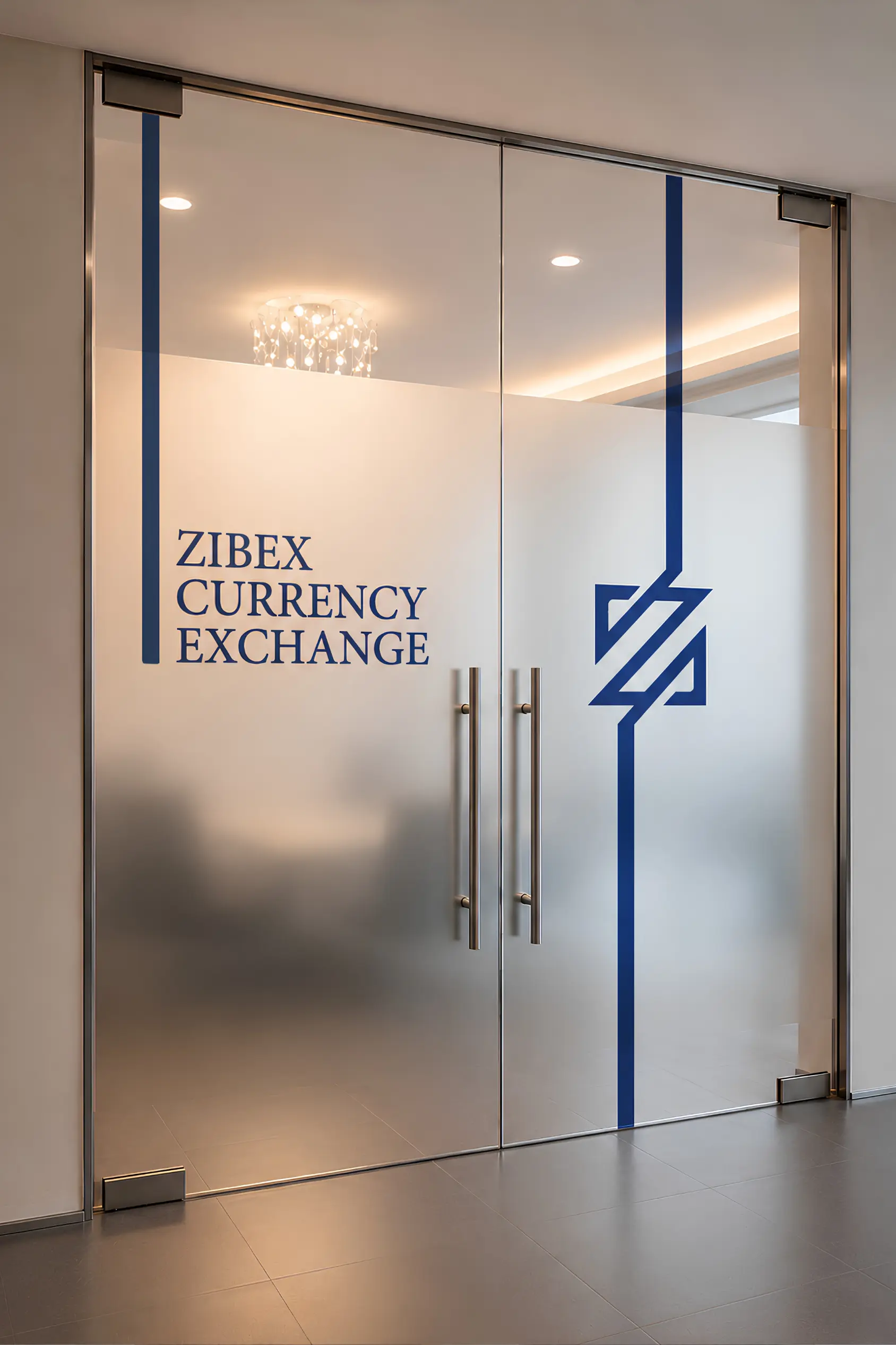

The resulting system gave Zibex a more consistent way to present itself across brand, print, environmental, and promotional touchpoints.
Instead of relying on individual pieces of creative to establish credibility, the identity itself became the organizing system. The result is a brand language capable of supporting formal communications, physical presence, and more expressive marketing while maintaining the same sense of clarity and recognition.