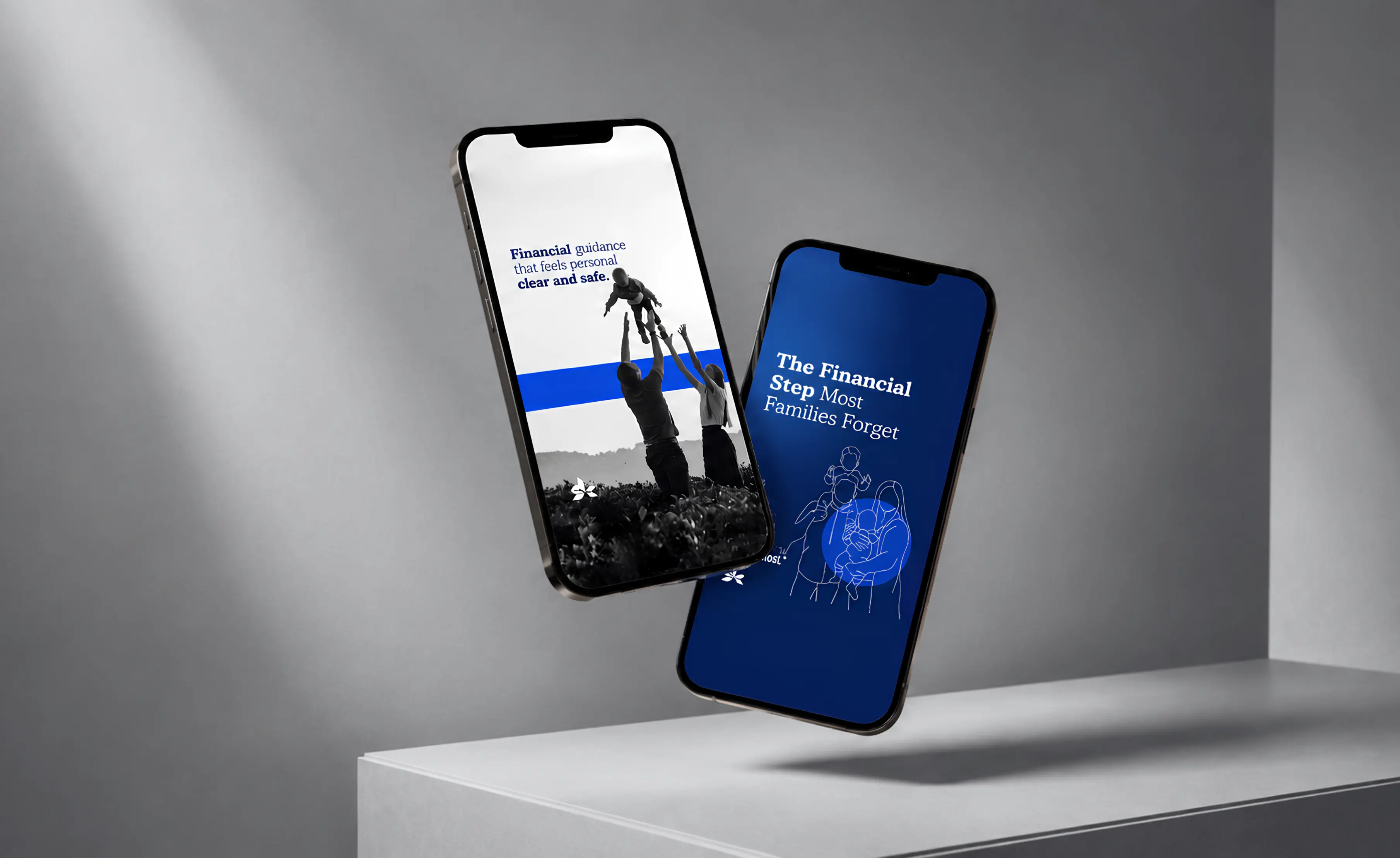
FEATURED WORK
A premium digital presence designed to bring strategy, clarity, and growth into one refined experience.

.svg)
Making financial guidance feel clearer, more personal, and easier to trust.


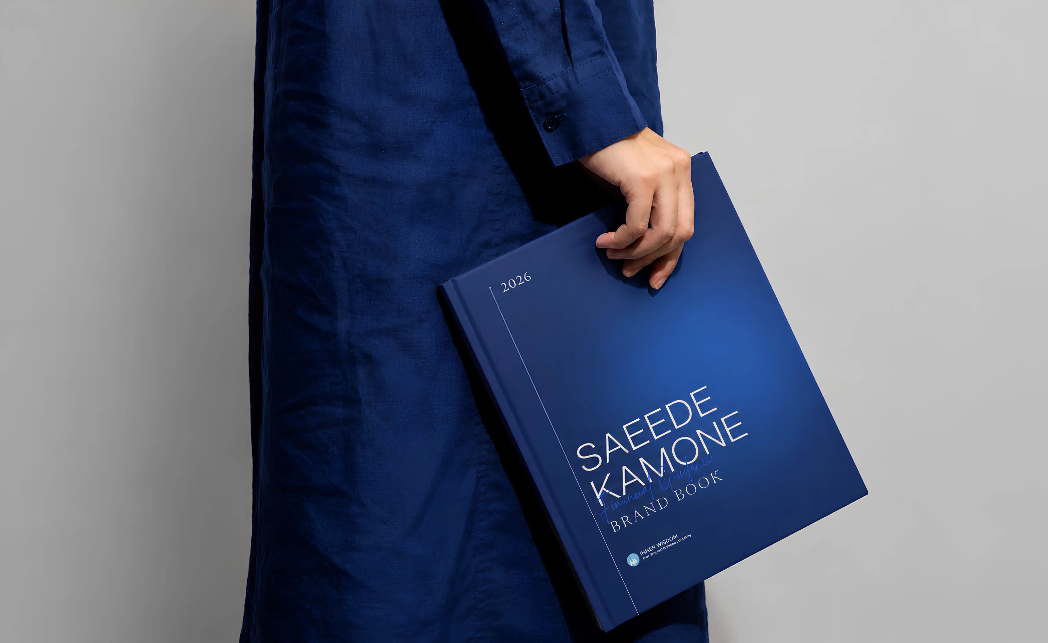
The identity was built around a simple tension: financial guidance needs to feel credible without becoming cold, and personal without losing structure.
A deep blue palette, editorial typography, a restrained visual system, and human-centered messaging gave the brand a more composed and trustworthy presence. The goal was not to make financial planning look more complicated, but to make the experience feel easier to enter and easier to understand.

The digital experience was organized around the questions clients are actually trying to answer: what do I need, what should I protect, how do I prepare for retirement, and what should I do next?
Instead of presenting insurance, investment, RESP, retirement, and related services as disconnected offerings, the website brings them into a clearer planning journey. The same visual language was then extended across mobile and branded materials so the experience remained recognizable beyond the website itself.
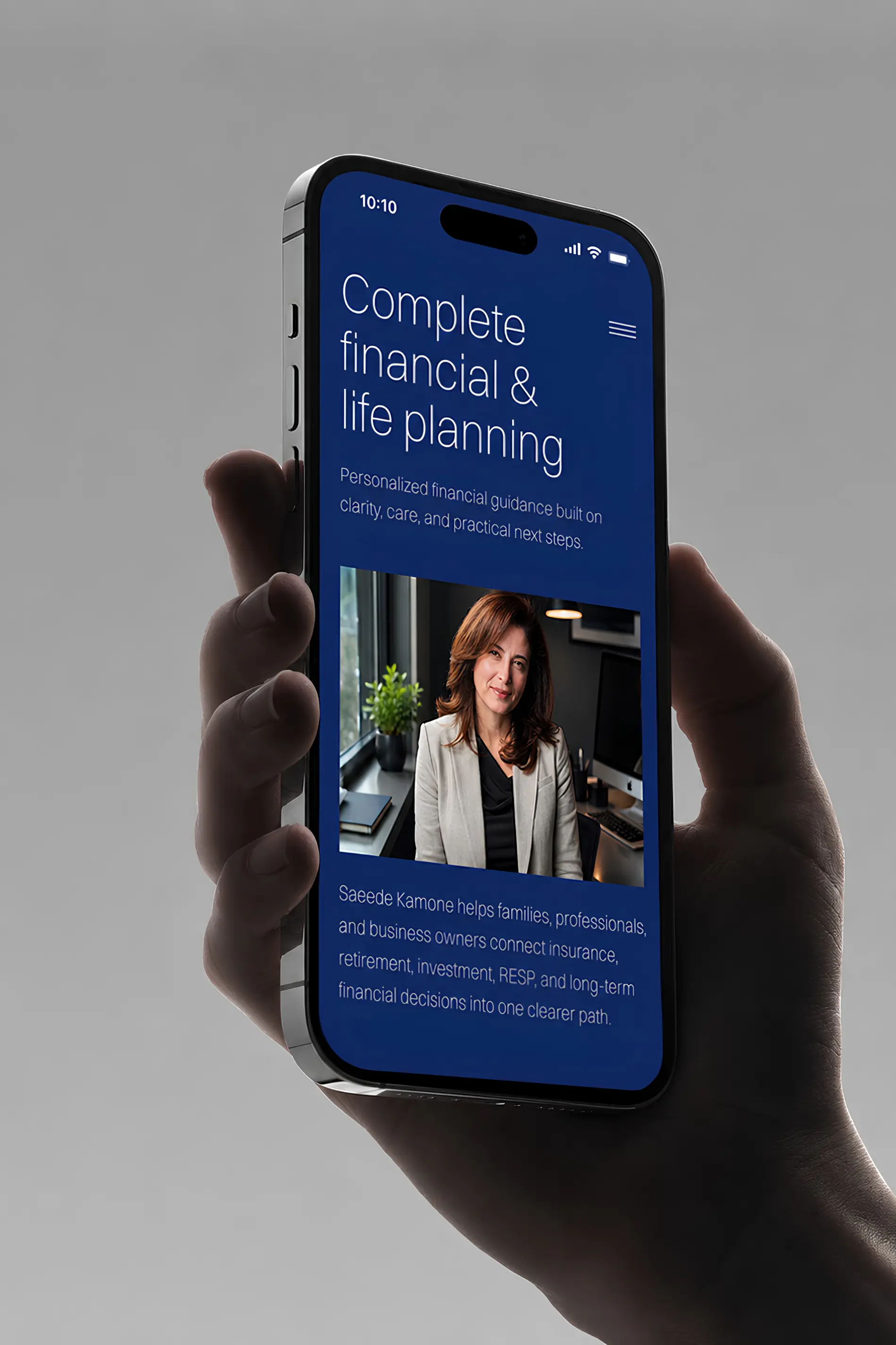

The finished system gave Saeede Kamone a more cohesive way to communicate a broad range of financial services without losing the personal nature of the relationship.
Brand, messaging, and digital experience now work together around one clearer idea: practical financial guidance built around people, families, and the decisions that shape their future. The result is a stronger foundation for trust, education, and long-term client engagement across web, mobile, and supporting brand materials.