FEATURED WORK
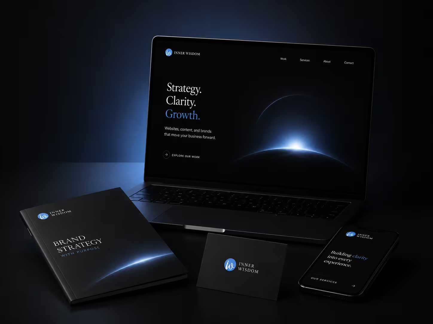
A premium digital presence designed to bring strategy, clarity, and growth into one refined experience.
.svg)
Turning a boutique aesthetics practice into a brand built to be remembered.

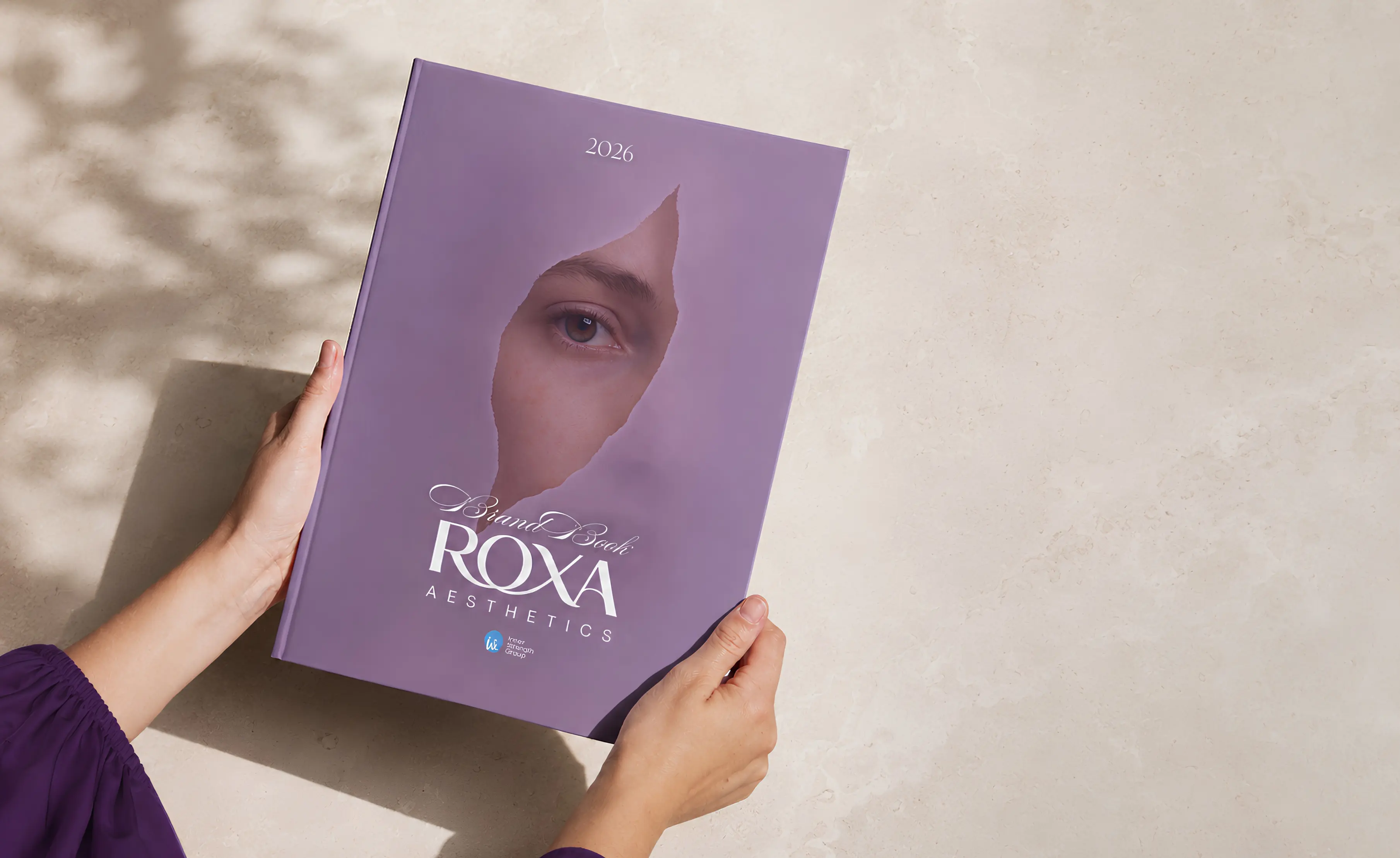
The identity was developed to sit between two worlds: the precision expected from a medical aesthetics practice and the warmth clients want from a personal beauty experience.
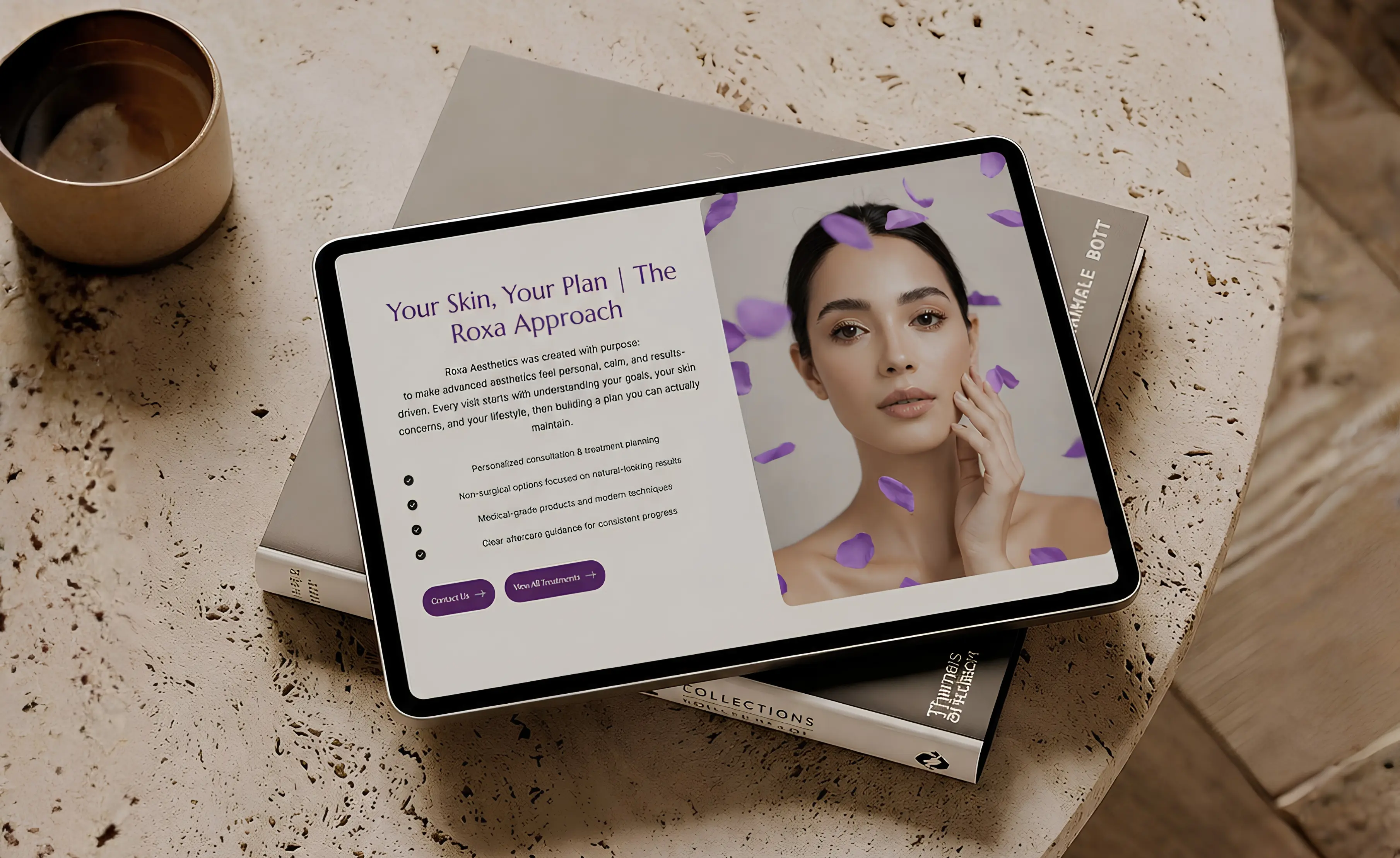
A restrained purple palette, refined typography, editorial composition, and tactile brand applications gave Roxa a visual language that could feel elevated without becoming distant. Rather than treating the logo, website, and campaign assets as separate pieces, the system was designed to make every touchpoint feel recognizably Roxa.

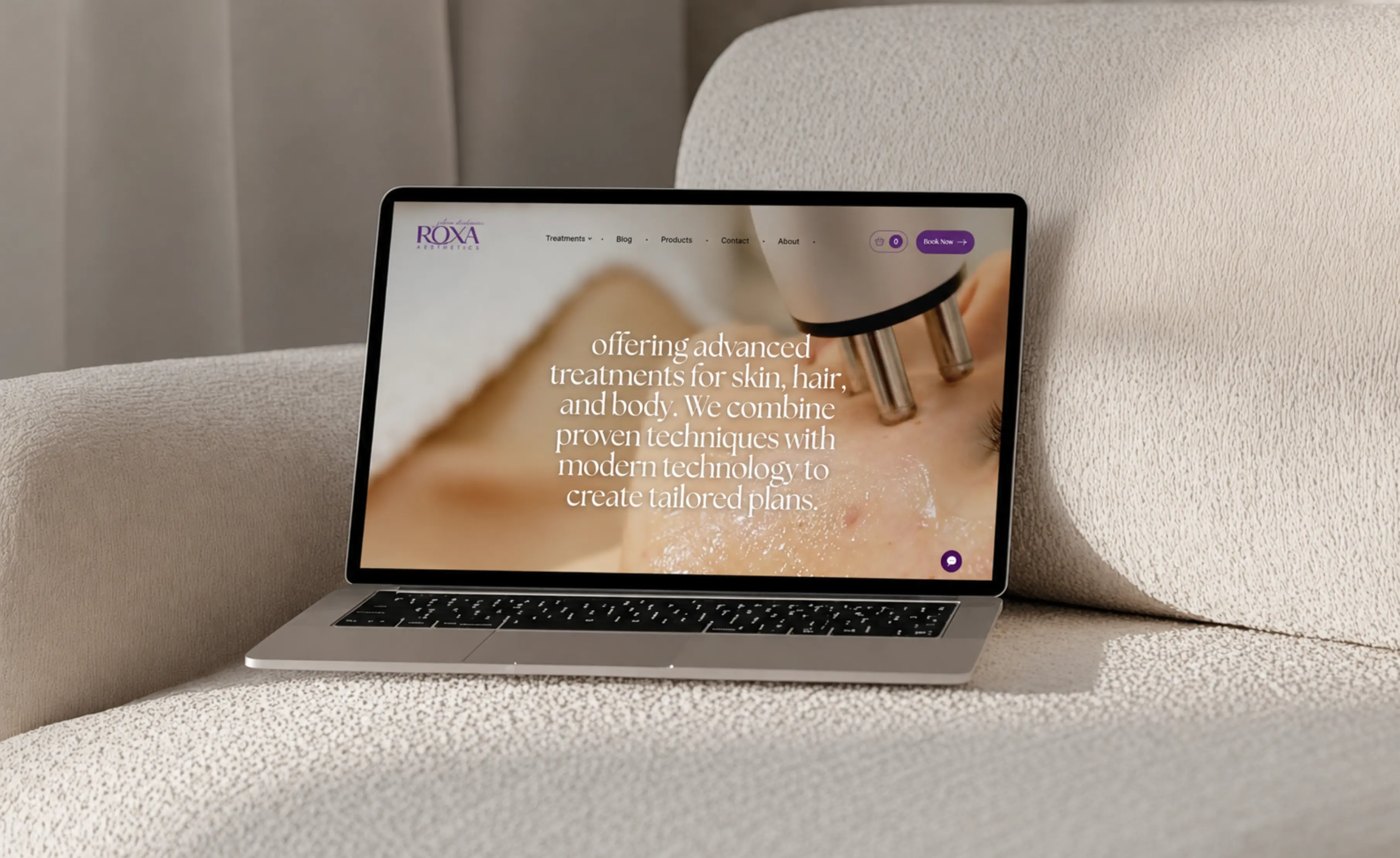
The digital experience was built around the way clients actually evaluate aesthetic care: understand the approach, explore the right treatment, build trust, and then take the next step.
Instead of letting a growing treatment catalogue feel clinical or fragmented, the website gives the brand a calmer hierarchy and clearer paths through services, education, consultation, and booking. The same visual system was then carried into mobile and campaign content so the experience stayed coherent beyond the website.
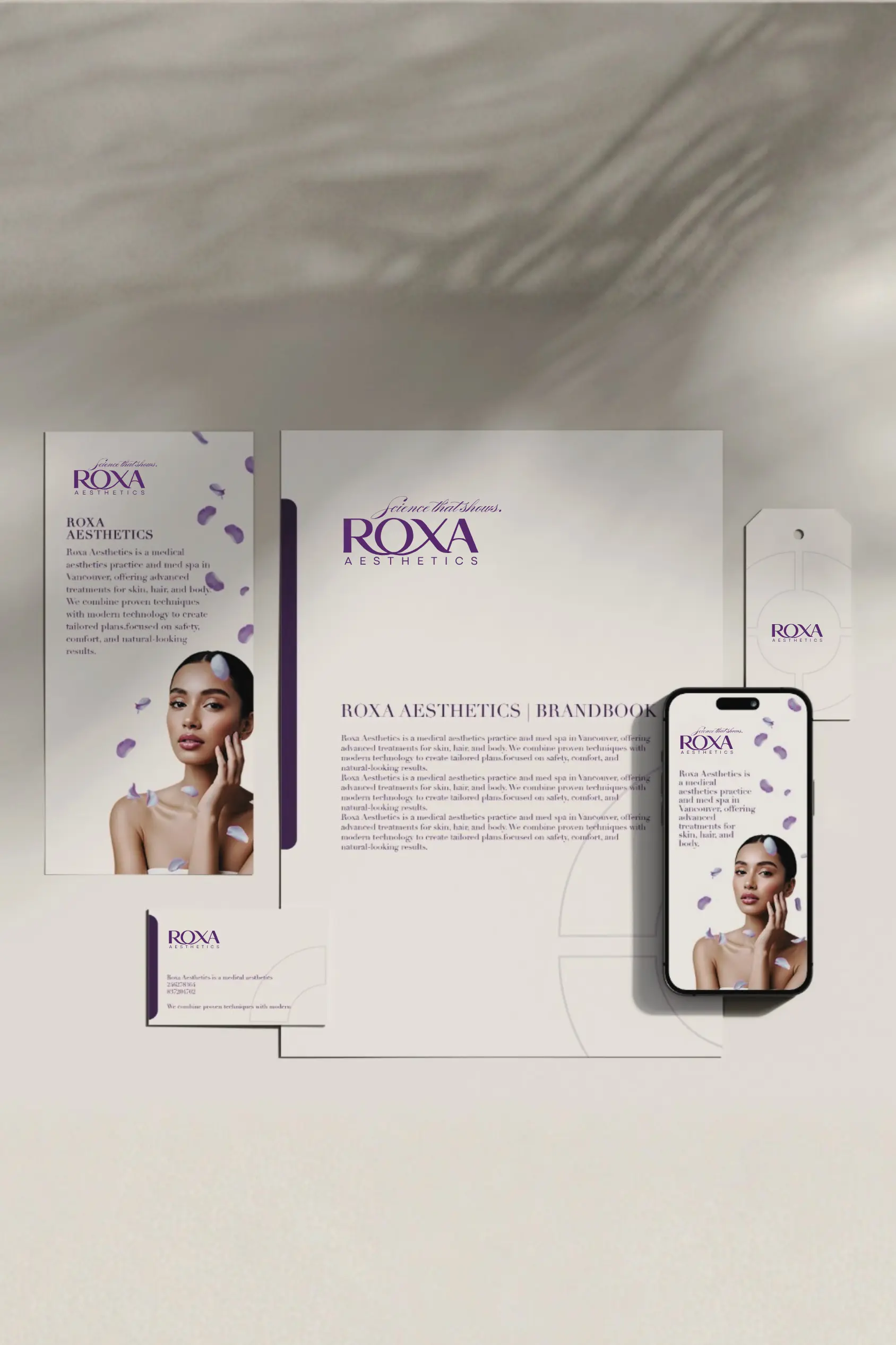
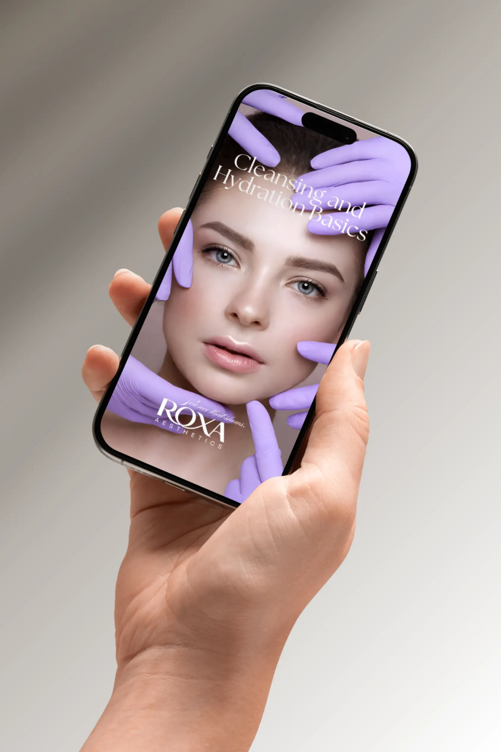
The project gave Roxa a more coherent foundation for growth: a clearer visual identity, a stronger digital presence, and a creative system capable of extending across web, mobile, social content, and branded materials.
More importantly, the different parts of the customer experience began speaking the same visual language. From first discovery to treatment research and booking, Roxa could present itself with greater consistency while preserving the personal, skin-first character at the heart of the business.