FEATURED WORK
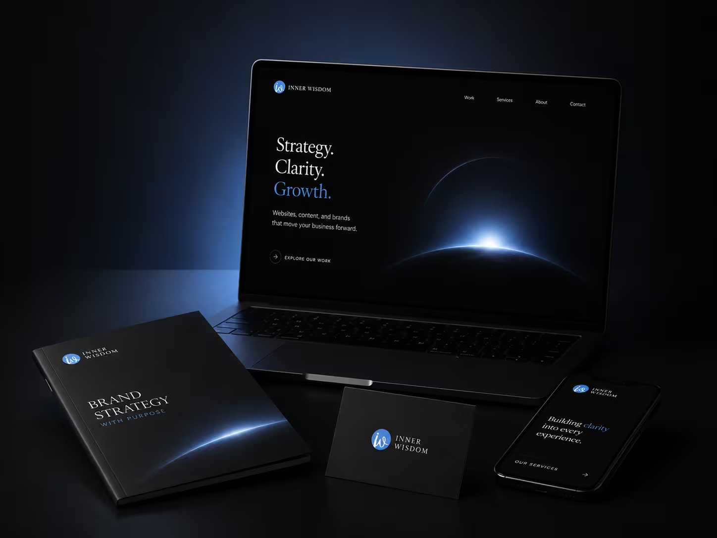
A premium digital presence designed to bring strategy, clarity, and growth into one refined experience.
.svg)
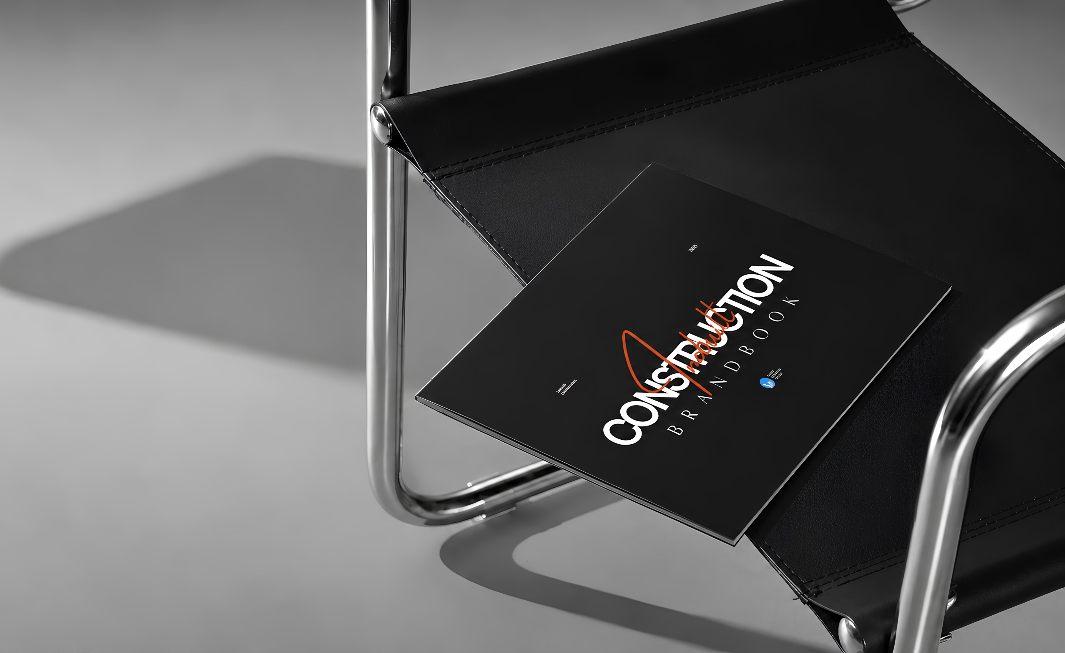
Building a refined brand system for an engineering-led construction company.
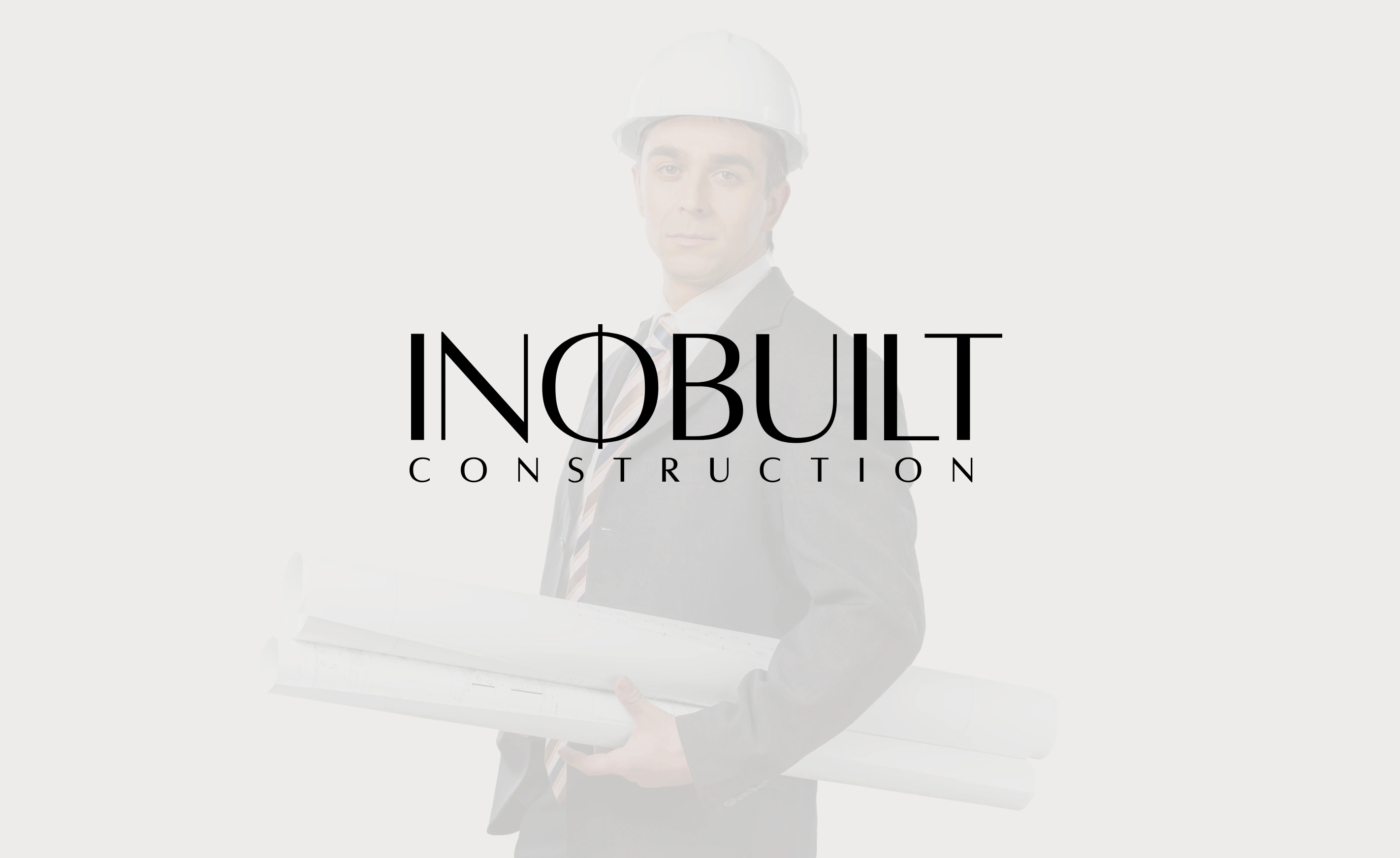
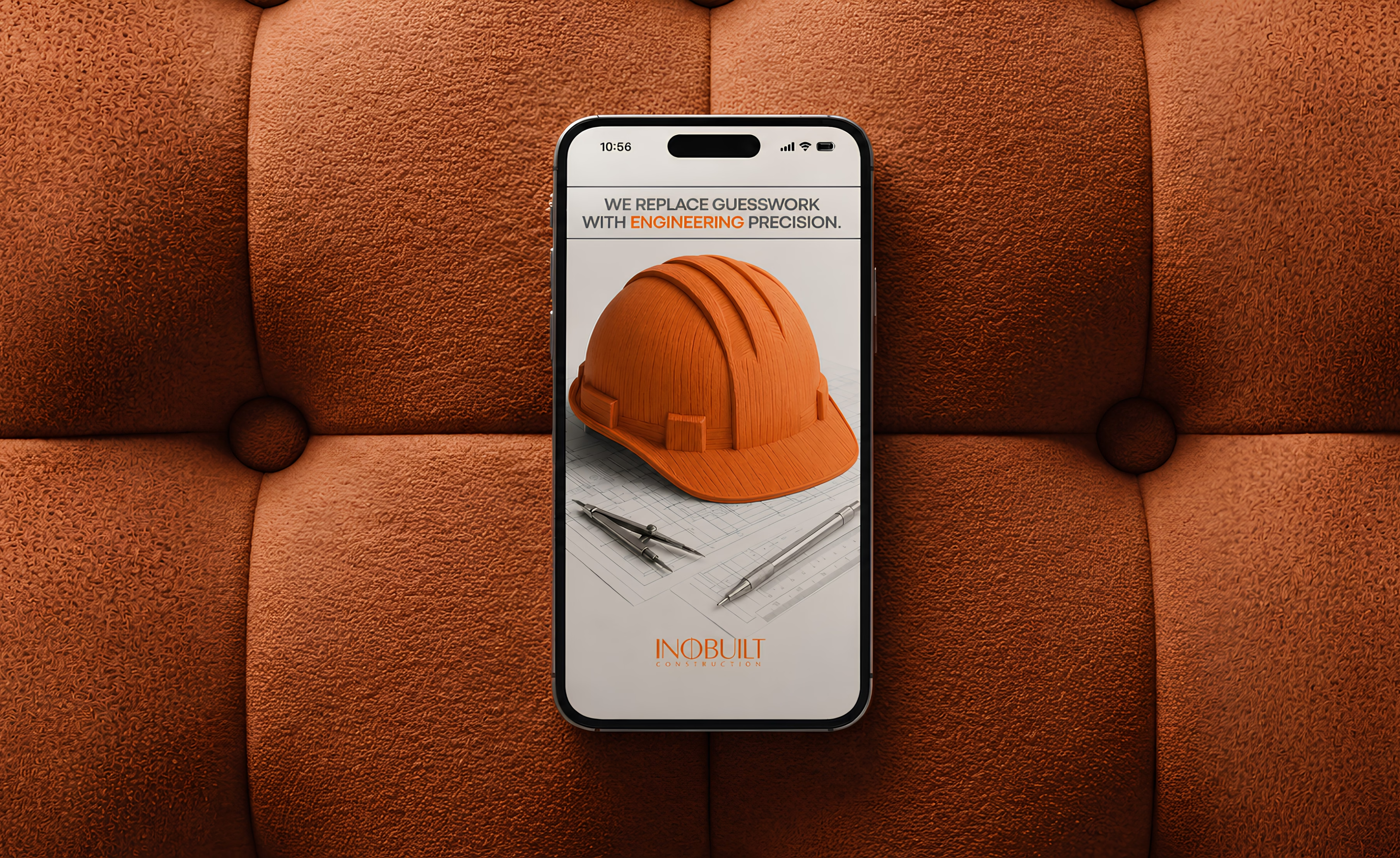
The identity system was built around the idea of precision through simplicity.
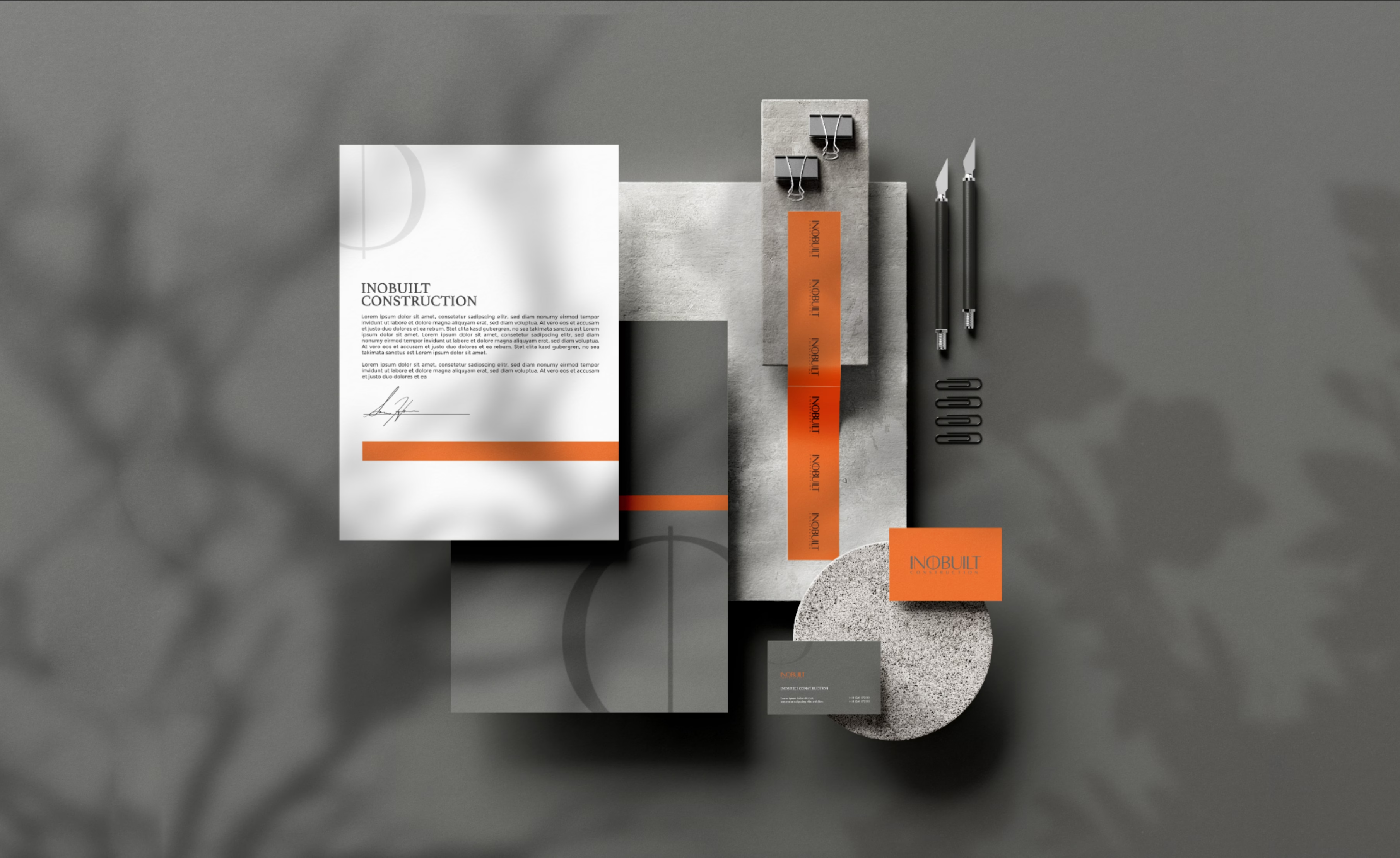
A refined typography system, structured layouts, and a distinctive orange accent created a balance between technical expertise and premium craftsmanship.
Every element was designed to communicate confidence, clarity, and a modern approach to construction.

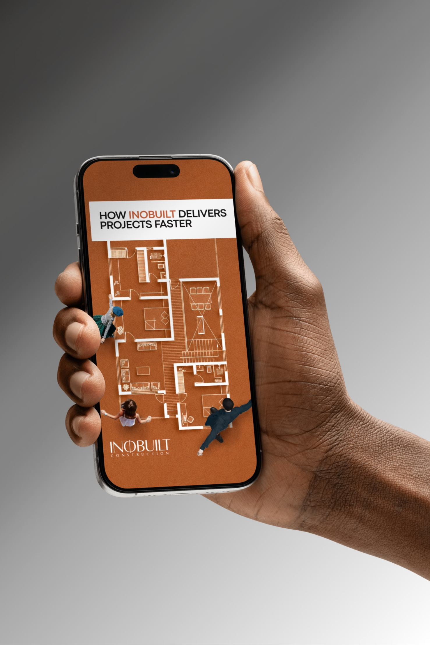
Beyond the core identity, InnerWisdom extended the visual language into practical brand applications including marketing materials, printed collateral, and digital communication assets.
The system creates consistency across different formats while giving Inobuilt a stronger foundation for presenting its services, process, and expertise.
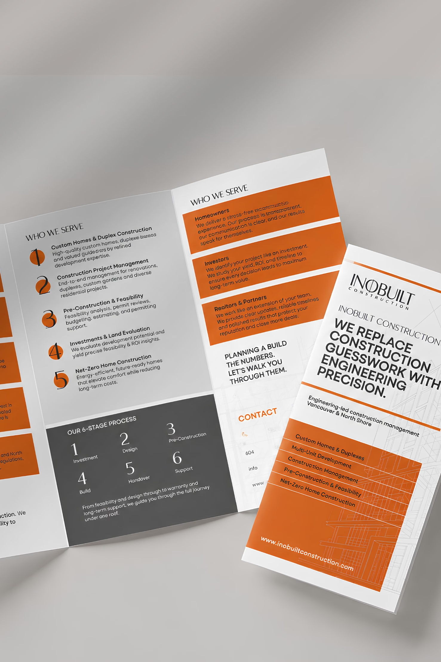
The project established a clearer and more recognizable brand foundation for Inobuilt Construction.
Through a structured identity system and consistent applications, the brand now has a stronger visual framework to communicate its engineering approach, services, and commitment to quality.